One of the foremost concerns when assessing a stereograph is how well it displays a 3D effect. After all, it’s hardly a stereograph without that special sensation of the third dimension. While the terms below classify how a particular stereograph is or isn’t 3D, it can also be take into consideration whether or not the composition is arranged at its best for showing off depth.
Flat describes those views which are not really stereographs at all, although they obviously demonstrate an attempt. These views have been incorrectly photographed as described under How It’s Done. They look merely like a regular photo when viewed.
Pseudoscopic describes stereographs that experienced an issue in transposing their left and right sides, also described under How It’s Done. “One experiences a strange effect that makes the foreground part of the background,” is how John Waldsmith puts it in his Stereo Views guidebook.
Misalignment is fairly self-explanatory in that the two photos composing a stereograph are not properly aligned. Alignment, also, is mentioned under How It’s Done; essentially, the left and right sides need to be lined up with one another in order to be properly meshed together when viewed.
Hyperstereo describes something that can happen as a result of single-lens stereo photography—see How It’s Done. Rather than produce a normal stereograph or a nonfunctional one, this shift of the camera can cause the view to look as though it’s a miniature model. It happens when the distance between lenses is greater than 2-1/2″.
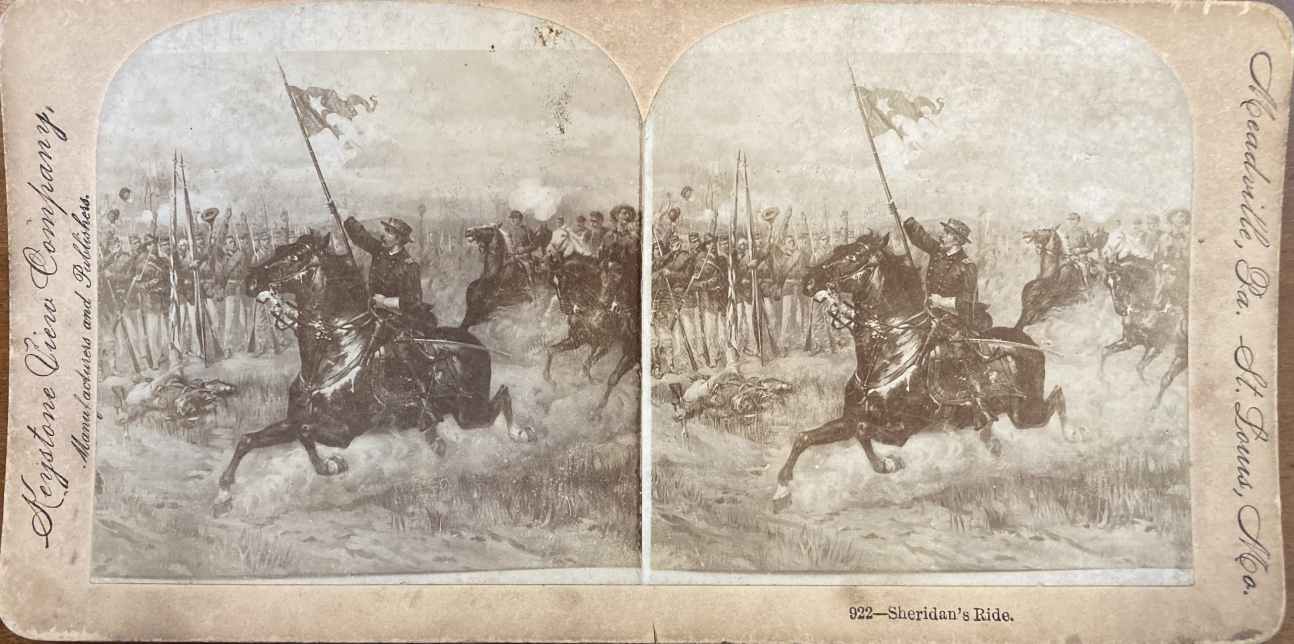
This stereograph is merely a two-dimensional illustration photographed in stereo. The photographer may have done this in an attempt to display an action scene of the Civil War, which could not actually be captured by the photo technology of the time.
Free Viewing
Normally stereographs are viewed with a stereoscope, but stereoscopes aren’t convenient to carry around, and the human eye can actually glean the 3D effect without assistance. As mentioned under History, viewing a stereogram requires the same eye movement as free viewing a stereograph, so if you can make out those hidden 3D images, you’ve already trained your eye muscles. If not, perhaps the provided instructions can help.
If you’re on a mobile device, you can follow the instructions exactly as they are listed for encountering a physical stereograph in person. If you’re on a computer, it’s still possible to free-view without lifting the image up or down, but it may take some practice with the regular method beforehand.
Hold the stereograph out in front of you, about an arm’s length or a little closer.
With the stereograph out of your line of sight, focus on a spot in the distance, far beyond your arm’s length.
Bring the stereograph into your line of sight without altering your focus from that distant spot.
By focusing your eyes this way, you should see the two images merge and produce a 3D effect. It may not happen on the first try, or even the second, but takes multiple rounds of practice. Lots of opportunities for trying are available in the Collection.
Presentation
How a stereograph is displayed is another point of evaluation. Most often, stereo positives were trimmed and mounted on thick cardstock, although some were printed directly onto cards, which tend to be more flimsy. Both kinds of cards often include publisher information, a caption, and if applicable, a series number. Mounts come in different sizes, depending on the era, and can present in different colors through different phases of time or publisher. Such known colors are lavender, lilac, pink, yellow, orange, green, but most commonly buff and white in different shades.
The frame of the stereograph on the card has a few options. Before the Civil War, images were left square, but after, arched tops became the popular trend. Of course, if a stereograph is pirated—see History—the frame may be shifted somewhat, causing edges to be cut off due to differing sizes and shapes.
Near the end of stereo photography's popularity, a trend arose for black mounts with gold text, often sold as "deluxe" views.
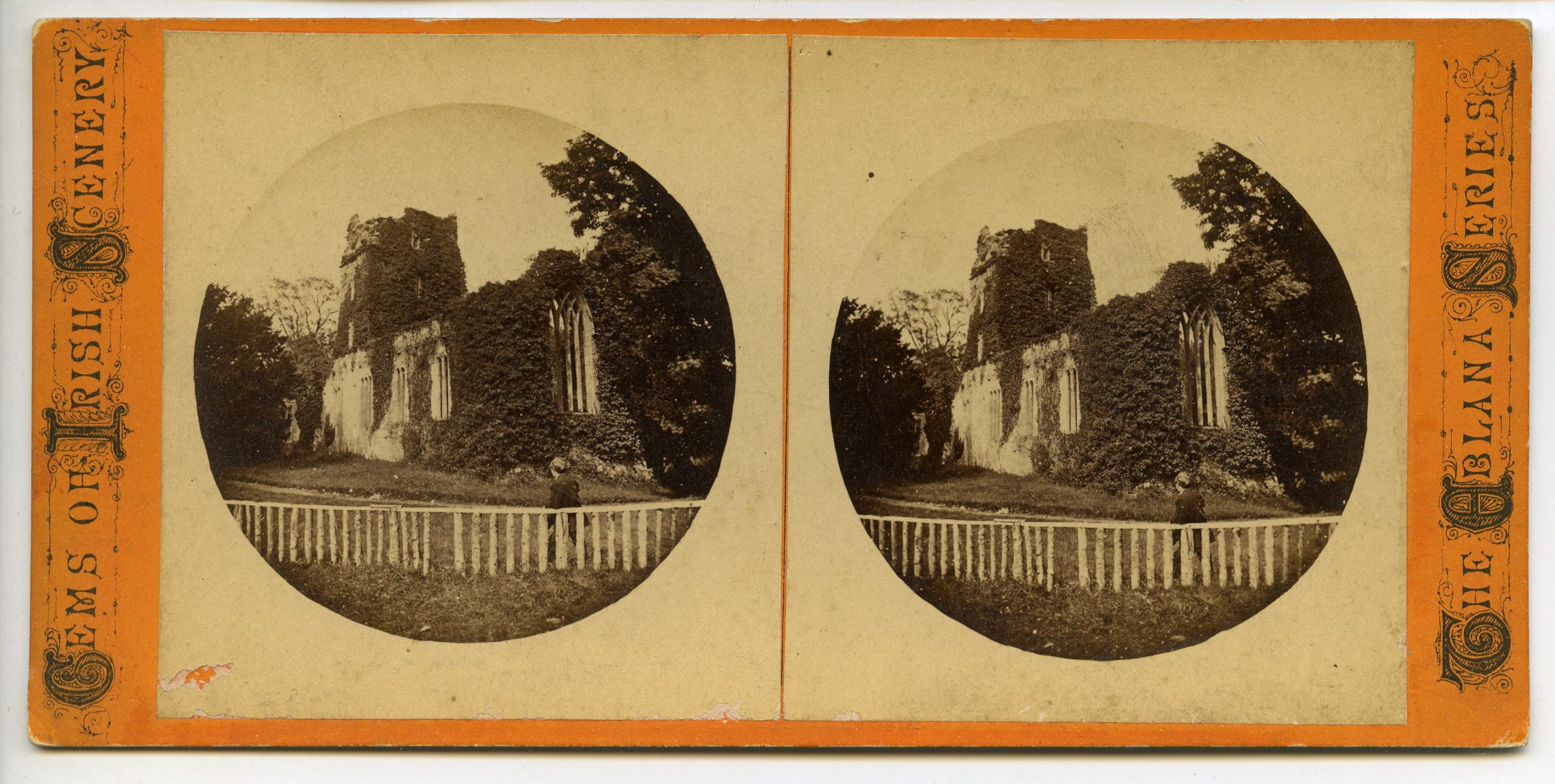
A stereograph with an unorthodox frame shape. This example was printed as circles onto square paper prior to mounting, perhaps by use of a cutout placed over the camera.
A more angular take on the arched top, made by trimming the top corners of square prints.
Condition
Especially among collectors, stereographs are judged by their overall quality on a basic scale. Different aspects can rank one stereograph higher or lower than another, typically in different forms of damage, but these mostly concern an aesthetic value that doesn’t necessarily reflect the specific importance a view may have as an artifact or otherwise.
Excellent describes the unblemished stereograph. Its image is sharp, and there aren’t any stains, scratches, or creases.
Very Good describes a pretty desirable stereograph, although there may be some signs of wear.
Good describes a stereograph which gets away with some stains, scratches, or creases that don’t generally detract from the image.
Fair describes a stereograph where damage gets in the way. There may be a tear right through one of the images, or mold spores growing in the middle of the picture.
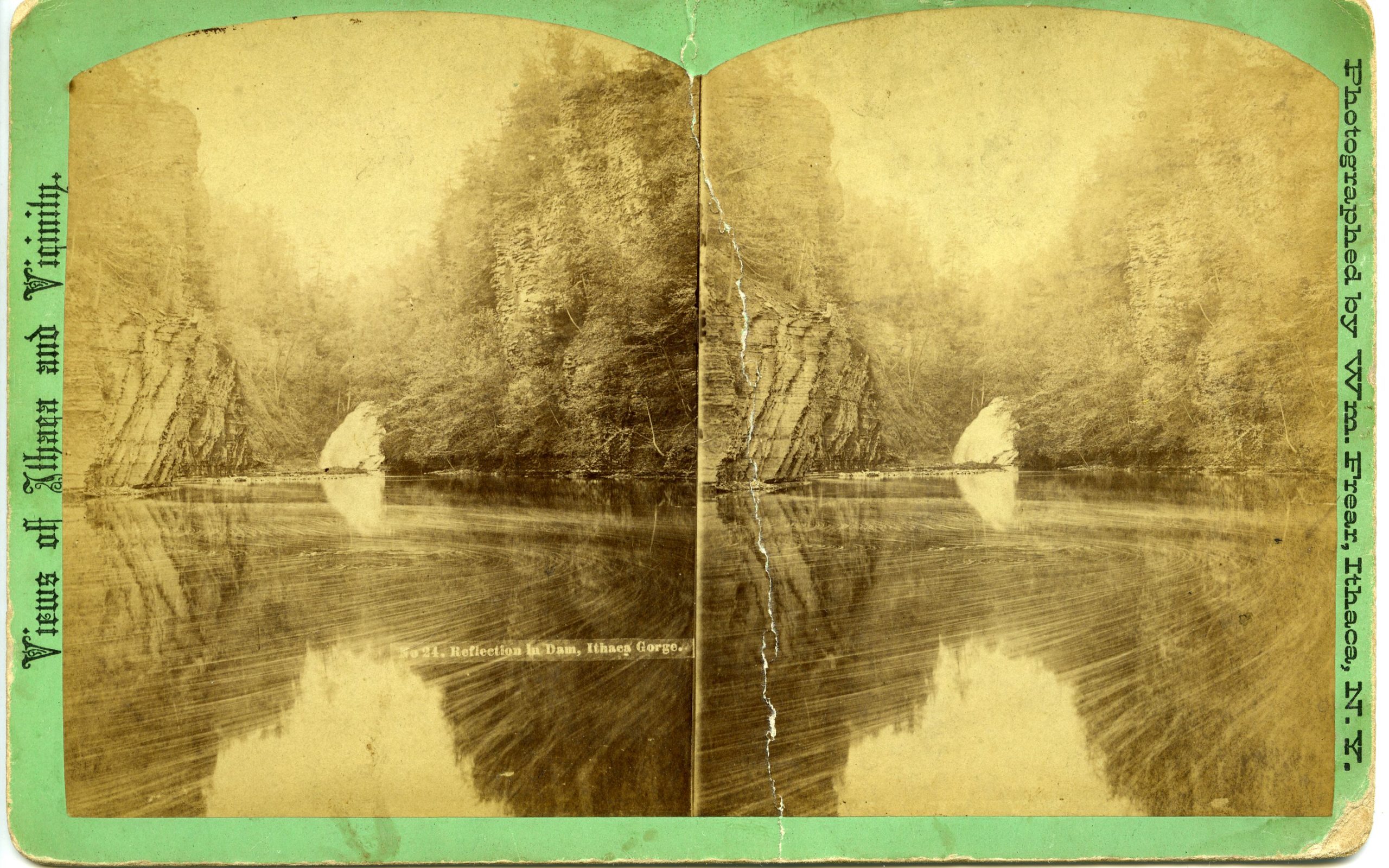
This stereograph has well-worn corners and various stains, but most notably, a hole in the lefthand image. It would probably be rated Fair.
This stereograph doesn't boast a lot of mount damage but for some wearing. The image, however, is extremely faded, and there are a couple of stains on both sides, which would probably bring its rating to Fair.
This stereograph has some wear on the corners, but also a faded image and some damage from folding in the center. It might be rated Good, but is probably Fair.
This stereograph has a clean, crisp image with relatively little wear. It would probably be rated Good to Very Good.